Choosing the right color palette for your home interiors is crucial as it significantly influences mood, aesthetics, and functionality. Colors not only define the ambiance of a space but also impact emotions and perceptions. In Kerala, the selection of colors is influenced by its tropical climate, traditional architectural styles, and cultural aesthetics. The humid weather, abundant greenery, and strong heritage elements make color choices unique for homes in this region. This guide will help you select the perfect color palette that compliments your home while considering Kerala’s climate and design preferences.
Understanding Kerala’s Architectural & Climatic Influences on Colors
Traditional Kerala Homes & Color Use
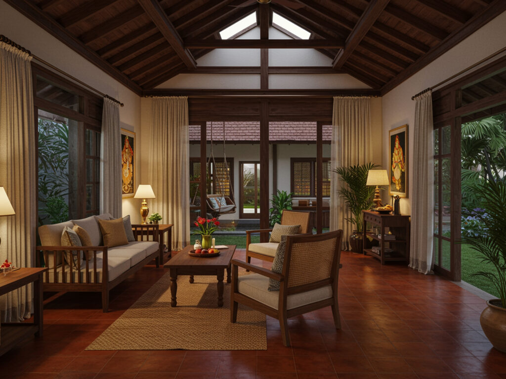
Kerala’s traditional homes, such as Nalukettu and Tharavadu, incorporate natural materials like teak wood, clay tiles, and laterite stone. These homes embrace earthy tones that blend with the environment, such as:
- Terracotta and ochre – Inspired by clay tiles and traditional flooring.
- Deep browns and greens – Reflecting wooden structures and lush surroundings.
- Mustard yellows and maroons – Seen in temple murals and heritage architecture.

Impact of Kerala’s Climate on Colors
Given Kerala’s high humidity and heavy monsoons, color choices should focus on longevity and comfort:
- Lighter shades (off-whites, pastel blues, and soft greys) help maintain cool indoor temperatures and prevent moisture buildup.
- Dark shades absorb more heat and might make rooms feel warmer, making them less ideal for tropical climates.
- Moisture-resistant and anti-fungal paints are essential to prevent wall damage from prolonged dampness.
Contemporary Kerala Homes
Modern homes, including apartments and villas, are shifting towards:
- Pastel shades (mint green, blush pink, powder blue) for a soft, elegant look.
- Neutral tones (beige, grey, and white) for a minimalistic aesthetic.
- Vibrant tropical colors like deep blues, greens, and gold, inspired by Kerala’s coastline and rich foliage.
Factors to Consider When Choosing a Color Palette
Natural Lighting & Room Orientation
- North-facing rooms get limited sunlight, making warm shades (peach, cream, soft yellow) ideal.
- South-facing rooms receive ample sunlight, allowing cooler tones (blues, greys) to balance the warmth.
- Rooms with excessive light can use darker shades to reduce glare, while low-light rooms benefit from light-reflecting colors.

Room Size & Space Perception
- Light colors make rooms appear more spacious and airy.
- Dark shades create a cozy and intimate feel, best suited for large rooms or accent walls.
Psychology of Colors in Interiors
- Warm colors (yellow, orange, red) add energy and are ideal for living rooms and dining areas.
- Cool colors (blue, green, lavender) promote relaxation and work well in bedrooms and study rooms.
- Neutrals (white, beige, grey) provide versatility and modern appeal, suitable for any room.
Functionality of the Room
- Living Room: Warm and welcoming shades like pastel yellow, cream, and muted blue.
- Kitchen: Clean and fresh hues like white, light green, and soft grey.
- Bedrooms: Calm and cozy tones like sky blue, lavender, and warm beige.
- Bathrooms: Refreshing colors like aqua blue, soft green, and white.
- Puja Room: Sacred and traditional colors like gold, maroon, and sandalwood.
The 60-30-10 Rule for a Balanced Color Scheme
A simple yet effective strategy to create a well-balanced interior:
- 60% Dominant Color: The primary shade used on walls.
- 30% Secondary Color: Used in furniture and upholstery.
- 10% Accent Color: Highlighted in decor elements like cushions, rugs, and artworks.

Kerala-Inspired Color Combinations
- Coastal Blues & Beiges – Inspired by Kerala’s serene backwaters.
- Earthy Browns & Greens – Reflecting traditional wooden homes and lush landscapes.
- Pastel Pinks & Whites – A modern fusion for airy interiors.
Choosing the Right Paint Finishes for Kerala Homes
Matte vs. Glossy Finishes
- Matte finish – Best for hiding imperfections, but harder to clean.
- Glossy finish – Easier to maintain but can highlight wall imperfections.
Weather-Resistant Paints
Given Kerala’s monsoons, weatherproof paints prevent peeling and fungal growth.
Anti-Fungal & Washable Paints
- Essential for high-humidity areas to maintain wall integrity and hygiene.
Popular & Trending Color Palettes for Kerala Homes
Traditional Kerala Home Color Schemes
- Terracotta, mustard yellow, and deep green – Reflecting temple murals and natural elements.
- Wooden tones with neutral combinations – Blending heritage with contemporary elegance.
Modern & Contemporary Kerala Homes
- Soft neutrals like off-white, beige, and greys.
- Coastal-inspired palettes featuring aquas and sea greens.
- Tropical and floral hues like pastel pinks, corals, and deep forest greens.
Fusion Color Palettes
Mixing traditional and modern tones for an eclectic yet timeless aesthetic.
Kerala-Inspired Accent Colors & Design Trends
- Nature-Inspired Accents – Greens, browns, and blues mimicking Kerala’s landscapes.
- Traditional Mural Art-Inspired Colors – Vibrant reds, yellows, and blues for artistic decor.
- Wood and Brass Combinations – Rich and elegant, perfect for traditional aesthetics.
- Handloom & Handcrafted Influences – Kasavu-inspired whites and golds for a regal touch.
Common Mistakes to Avoid When Selecting Colors
- Choosing trendy colors without considering long-term appeal.
- Ignoring the impact of lighting and furniture on wall colors.
- Using too many dark colors in small or low-lit spaces.
- Not testing paint swatches in different lighting conditions.
Conclusion
Selecting the right color palette for your Kerala home is a balance of tradition, climate considerations, and personal taste. While warm and earthy tones honor Kerala’s heritage, contemporary pastel and neutral hues bring in modern elegance. Always consider lighting, room size, and functionality when making a decision. Experiment, but maintain balance and harmony in your interiors.
Choosing the perfect color palette for your Kerala home can be overwhelming, but you don’t have to do it alone. At Faboolux, we specialize in creating stunning, well-balanced interiors that reflect your style while considering Kerala’s unique climate and architectural heritage. Whether you prefer a traditional earthy look or a sleek modern finish, our expert designers are here to guide you every step of the way. Contact Faboolux today for a personalized consultation and bring your dream home to life!